ADA Compliance Lets Everyone In Without Throwing Your Design Off
We’ve shared quick ways to check if you’re on the right path. That gives you a sense of where you are. If you’re like most organizations, you probably have some remediation work to do to get where you’re going (website accessibility and ADA compliance), because the vast majority of websites still are NOT adequately compliant.
According to the WebAIM Million, a 2019 study on the accessibility of the top 1,000,000 home pages, “97.8% of home pages (out of 1 MILLION tested) had detectable WCAG 2 failures!”
The Web Content Accessibility Guidelines (WCAG) inform the techniques for improving accessibility to make websites and other content accessible to all users protected by the Americans with Disabilities Act (ADA). The ADA civil rights law “prohibits discrimination against individuals with disabilities in all areas of public life…” Beyond ADA Compliance, Section 508 is a Federal law that requires all Electronic and Information Technology (EIT) developed, procured, maintained, or used by the federal government be accessible to people with disabilities.
What does that mean exactly? It means you’re not alone if you haven’t yet focused on inclusive design and website accessibility. Following the WCAG is a big part of the path toward ADA Compliance. It also represents an opportunity for those who choose to adopt these practices sooner rather than later. What it does NOT mean is that you need to start from scratch or give up your carefully crafted website.
The First Step Toward ADA Compliance is Not to Panic
ADA compliance through website accessibility and/ or remediation has been neither common knowledge nor common skills for most companies and web developers. That leaves many professionals anxious about making changes to the sites (and other assets) they’ve poured time, money and expertise into developing. It doesn’t mean they’re bad; it just means they’re just not finished.
We know how you feel though. We are just as passionate about our brand as you are about yours. Insisting on and ensuring accessibility isn’t easy to start with, let alone preserving the identity you’ve created. But here’s the good news: your website can look exactly or much the same before and after remediation for ADA compliance. And while you’ll barely notice the change, it will mean a world of difference for users with (and without) disabilities, delivering better experiences, quicker access to info, and easier processes through subtle changes.
Accessible Website Myth Busting
My website will become boring. MYTH!
The guidelines don’t say you can’t have movement in the form of GIFs, videos, etc. They say you have to handle them carefully in specific ways. If someone is telling you that you can’t, it means they don’t know how to implement the techniques and solutions required for accessible design.
Similarly, “black and white” (B&W) does not signify accessibility on its own. Yes, color contrast is important for accessibility, and B&W it is the ultimate color contrast, but there are many others that comply with the guidelines, and many ways to accommodate other colors. In fact, using color is great – it can help clarify content and improve brand recognition. The marketing team will love it. The only reason it would be B&W is if your brand or aesthetic is B&W!
We’ll have to redo the whole site review process. MYTH!
Busy executives and development teams don’t need to DO the accessibility testing, and remediation can be fairly quick and painless for developers working in concert with their accessibility experts. Even if you send it through one more round of reviews, chances are it will receive fast sign-off. Like we said – they probably won’t notice the changes beyond the fact that the user experience is so much better.
None of this work applies to my business. MYTH!
About 12.6 percent of the US population has a disability. Sure, it’s a minority. But that’s not the only impact of ADA compliance. Accessibility practices can be helpful to the whole population. Just as a wheelchair ramp helps parents with strollers, people temporarily on crutches, anyone with a shopping cart; or how closed captions allow any one of us to watch TV while at the gym, accessible design makes many experiences better for all without compromising important features.
Making changes for ADA compliance will hurt my SEO. MYTH!
Search engines rank responsive websites with ALT image descriptions that load quickly higher than those that don’t have those features of accessibility. Clear navigation and site structures help with overall user engagement via balanced colors, menus that adapt, improved search functionality, easy checkout, tabbed navigation, etc. None of these items detract from the able-bodied experience, and they often improve it overall.
Feel the Difference of ADA Compliance
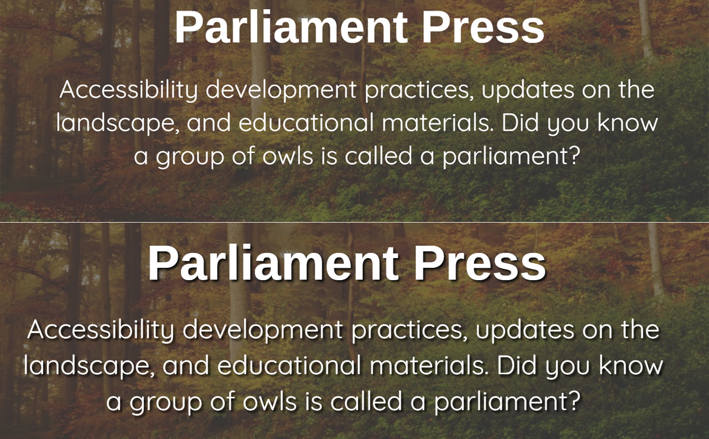
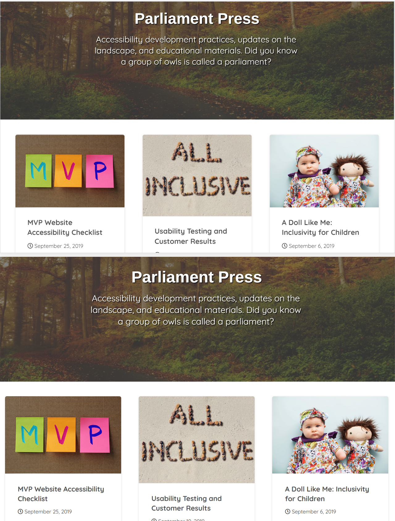
In the world of accessible design and ADA compliance, small things matter – a lot. As mentioned above, that’s good news – you can have your design and make it accessible too. To illustrate, take a look at a simple blog page (we’re using our own to protect the innocent and guilty) before and after tweaking it for ADA Compliance.
On the first image, we zoomed in so you can clearly see two versions of the same blog page header. As you can see, it’s okay to have a colorful background! You just need to consider the color contrast of the text against the background so that visitors are able to distinguish the words clearly.
In the top image, even though the font is large and the text is white there are some places where the edges of the text blend into the background image too much. This makes it hard for some visitors to read.
In the bottom image, all we have done is add a shadow beneath the text so that the edges of the text are more clearly defined against the background. This is just one method of making text more discernible against a background.

The next image is a zoomed out version of the page. Most people would not even notice the change but would feel better viewing it. Incorporating accessibility into your site does not always mean making drastic changes to the look and feel of the site. As you compare these two images, you can barely notice the differences. The aesthetics and style remain intact! This makes your marketers and designers happy while ensuring that a wider audience of visitors is able to read your content.

If you’re ready to test and remediate your own website for ADA compliance, contact us – we’d love to help!
